Dashboard Overview
The CMS Dashboard provides a clear summary of what is happening in your guide.
It shows important numbers, charts, and lists that help you understand how people are using your content and how your objects are performing. From this single page, you can quickly see visitor activity, popular objects, language usage, collections, and recent content updates.
The dashboard is designed to give you a fast overview without needing to open multiple pages. It is useful for daily or weekly check-ins to monitor growth, spot trends, and make small improvements to your content.
Below is an explanation of each section you see on the dashboard.
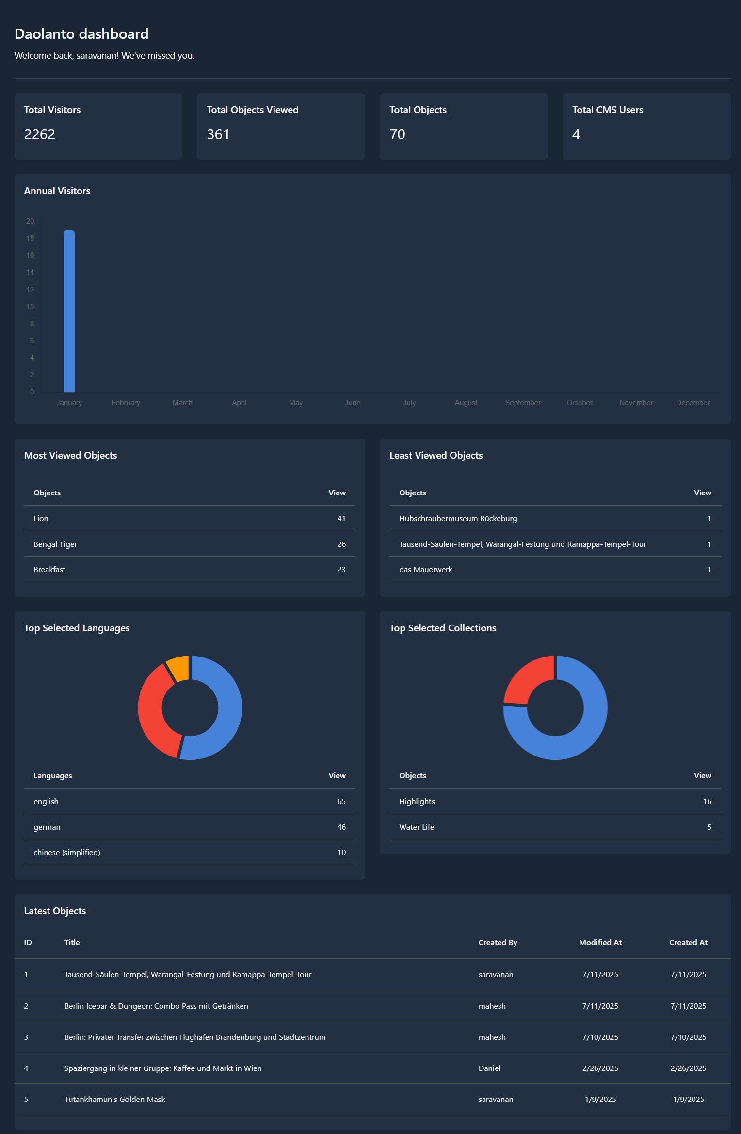
Summary Cards (Top Metrics)
At the top of the dashboard, you will see four summary cards:
Total Visitors
Shows the total number of people who have visited your guide.
Total Objects Viewed
Shows how many times objects have been opened or viewed by visitors.
Total Objects
Shows the total number of objects currently created in your guide.
Total CMS Users
Shows how many users have access to this CMS.
These cards give a quick snapshot of overall activity and size of your guide.
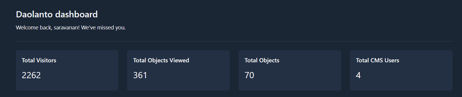
Annual Visitors
This chart shows how many visitors your guide receives each month.
- Each bar represents one month
- Higher bars mean more visitors
- Lower bars mean fewer visitors
You can use this chart to notice:
- Growth over time
- Seasonal changes
- Months with unusually high or low traffic
Most Viewed Objects
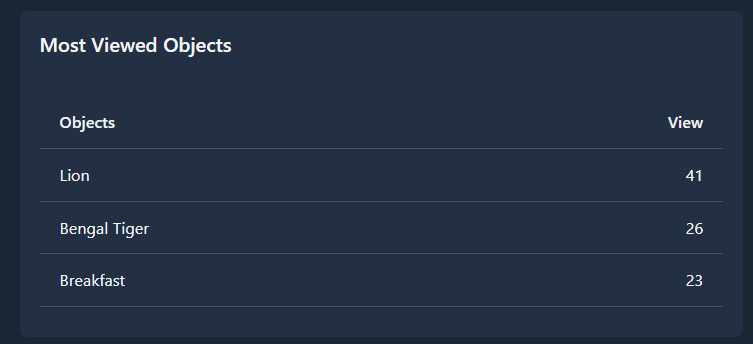
This table lists the objects that have the highest number of views.
For each object, you can see:
- Object name
- Number of views
This helps you understand which content is most interesting to visitors.
You may use this information to:
- Create more objects on similar topics
- Improve related content
- Feature popular objects more prominently
Least Viewed Objects
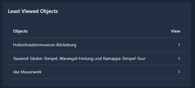
This table shows objects that receive very few views.
This helps you identify content that may need:
- Better titles or descriptions
- Better placement inside collections
- More promotion
- Content improvement
Low views do not always mean bad content, but they indicate where attention may be needed.
Top Selected Languages
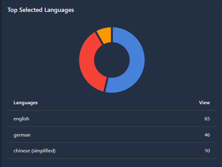
This section shows which languages visitors most often choose.
You will see:
- A chart showing language distribution
- A list of languages with usage counts
This helps you understand your audience’s language preferences and decide:
- Which languages to prioritize
- Whether more translations are needed
Top Selected Collections

This section shows which collections visitors open most frequently.
You will see:
- A chart showing collection popularity
- A list of collections with counts
This helps you understand what categories of content visitors are most interested in.
You may use this to:
- Add more objects to popular collections
- Improve weaker collections
- Reorganize content if needed
Latest Objects
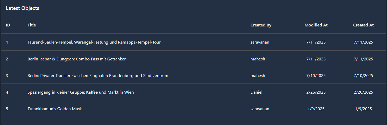
This table shows the most recently created or updated objects.
For each object, you can see:
- ID
- Title
- Created by
- Modified date
- Created date
This section helps you track recent work and team activity.
Best Practice
Review the dashboard regularly (daily or weekly).
A short review of 2–3 minutes is enough to understand what is working well and what may need improvement.
The dashboard is meant to support better decisions and steady content improvement over time.